side gig supersalt
Side Gig is a new brand created by Anthony Giglio — a writer, educator, and one of the most entertaining wine and spirits authorities on the planet. Giglio’s witty, unpretentious style can be discerned in the weekly “Wine Wise Guy” column he writes for Food & Wine, for whom he is a longtime Wine & Spirits Contributor. SuperSalt — an organic, hand-selected seasoning salt of Giglio’s design — is the first product being brought to market from Side Gig. For many years Giglio has been making and using his SuperSalt for family and friends, but now for the first time he is making it available to everyone.
Working with Jennifer, Nick and the Level Group team is an ongoing pleasure. I initially chose them to create a logo and label for my Side Gig SuperSalt, thinking it was a relatively straight-forward process that could be fleshed out via email. Jennifer and Nick’s approach, however, is entirely personal and deliberately thoughtful; I dare say it’s a bit therapeutic, too, requiring a healthy dose of introspection on my part. Over the course of several weeks we met or spoke by phone to dig deep into my personality and thought processes, especially by way of storytelling, until we finally got to the essence of what my brand, logo and product should look like, feel like and convey. The resulting logo, label and collateral is simply stunning. And the feedback from nearly everyone who sees it is extraordinary. I really could not be happier with their work and look forward to continuing our journey together as my brand expands.
— Anthony Giglio
President, Side Gig
IDENTITY
brand positioning strategy, concept, design
The Side Gig SuperSalt Branding & Packaging won a Graphis Design Annual 2022 Silver Award, and the Packaging won a 2020 American Graphic Design Award from GDUSA
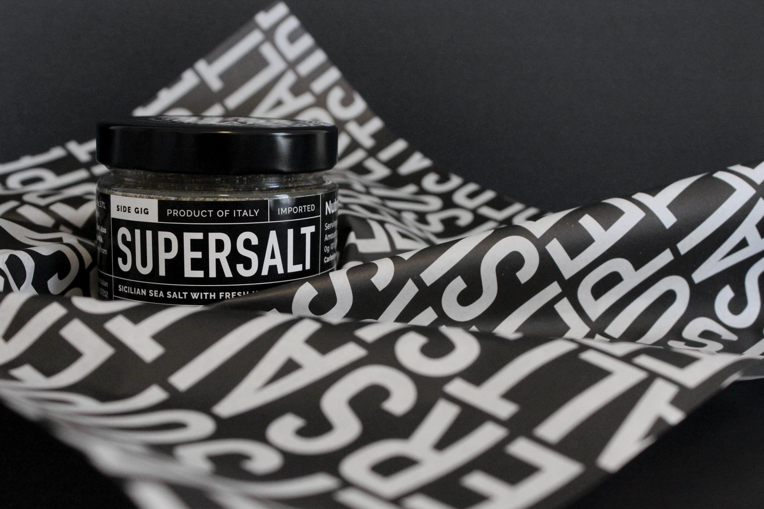
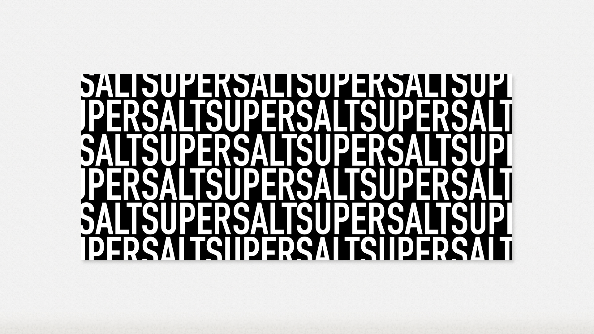
The SuperSalt logotype is both strong and unconventional, paving the way for an overall identity system that is graphic and eye-catching. This design approach allows SuperSalt to stand out on its own as well as next to similar products.
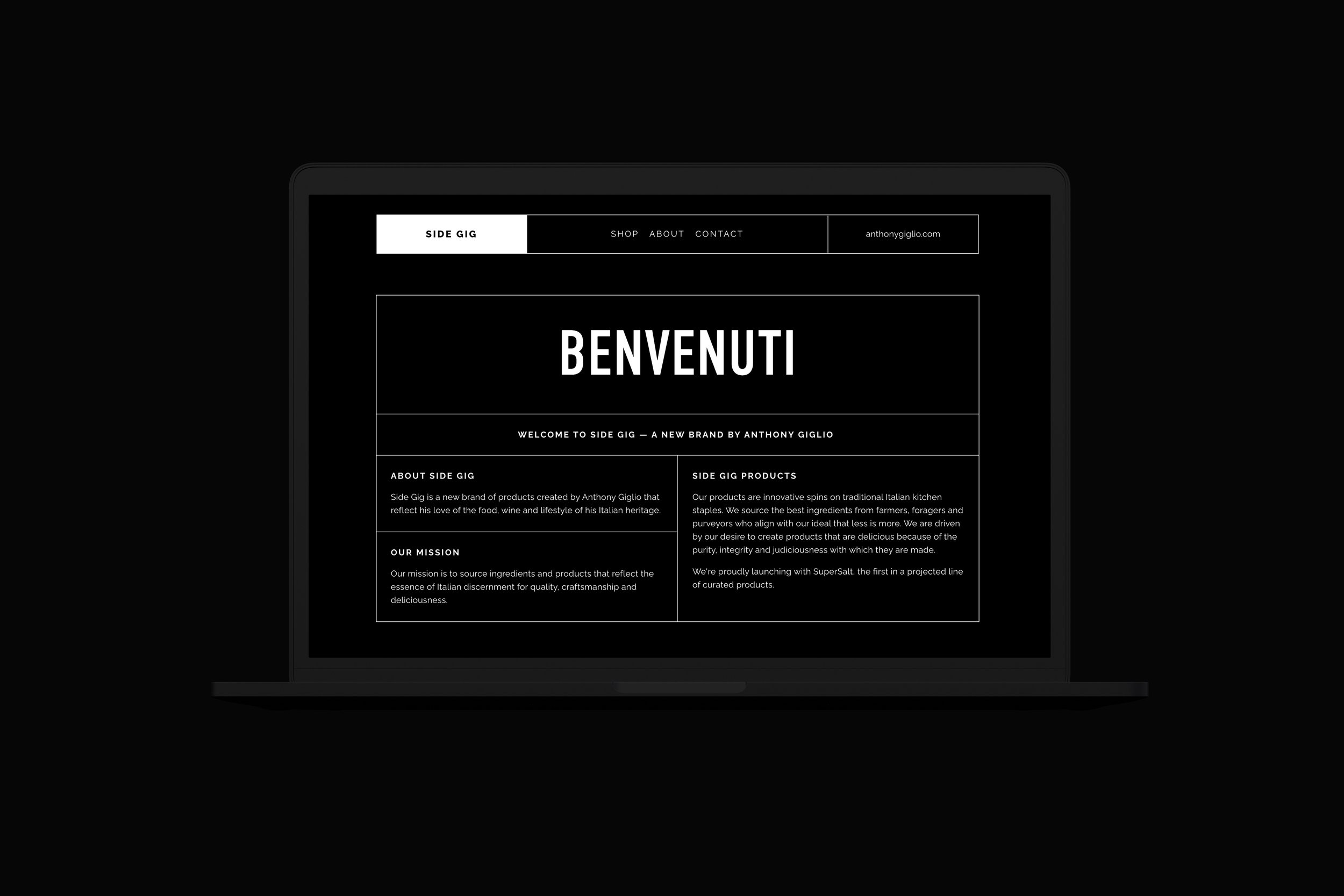
Similarly, the logotype for Side Gig is also graphic and simple, yet has a more approachable feel, allowing for future versatility when branding new products.
WEBSITE
visit site: side-gig.co
strategy, content, information architecture, concept, design, front-end development
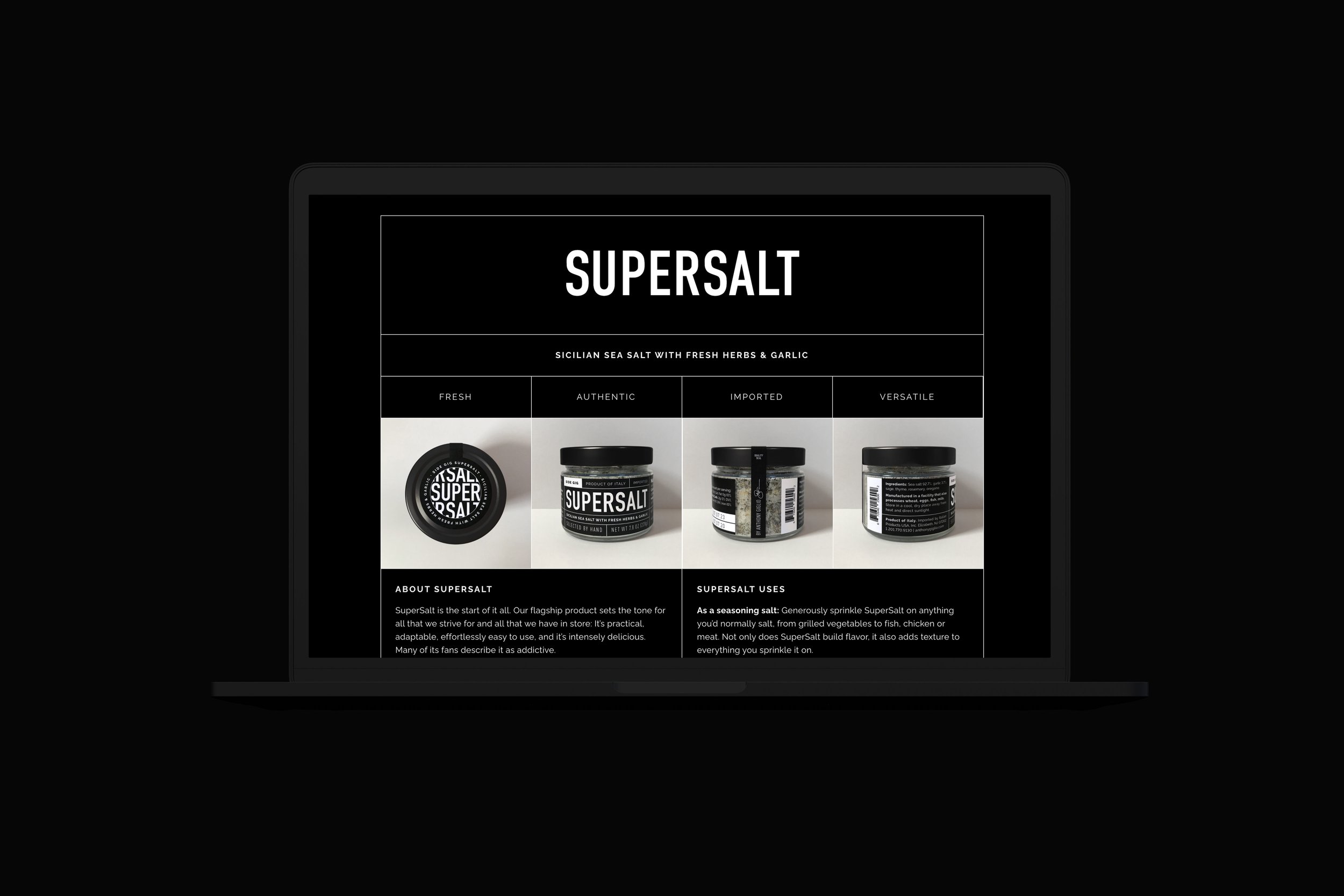
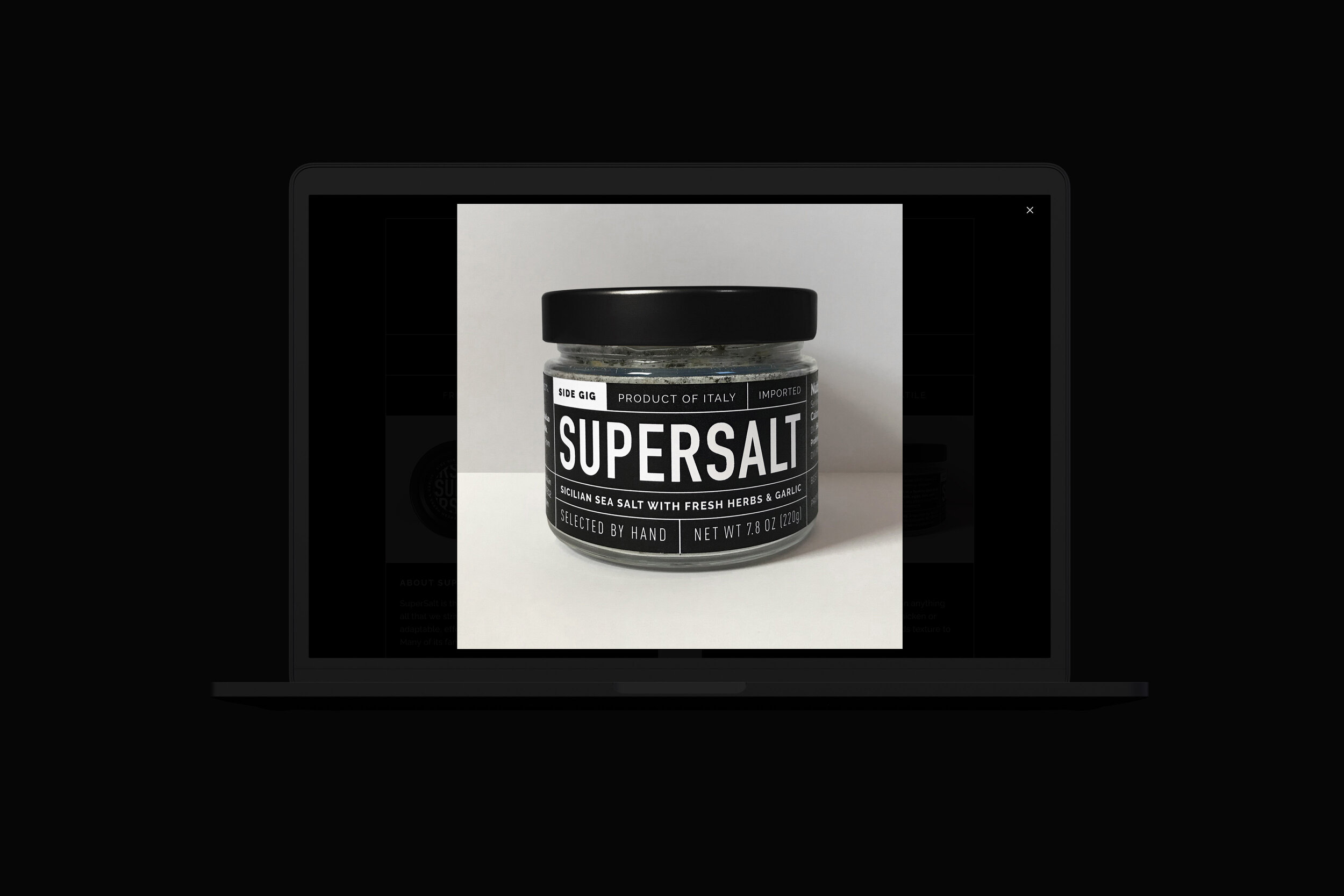
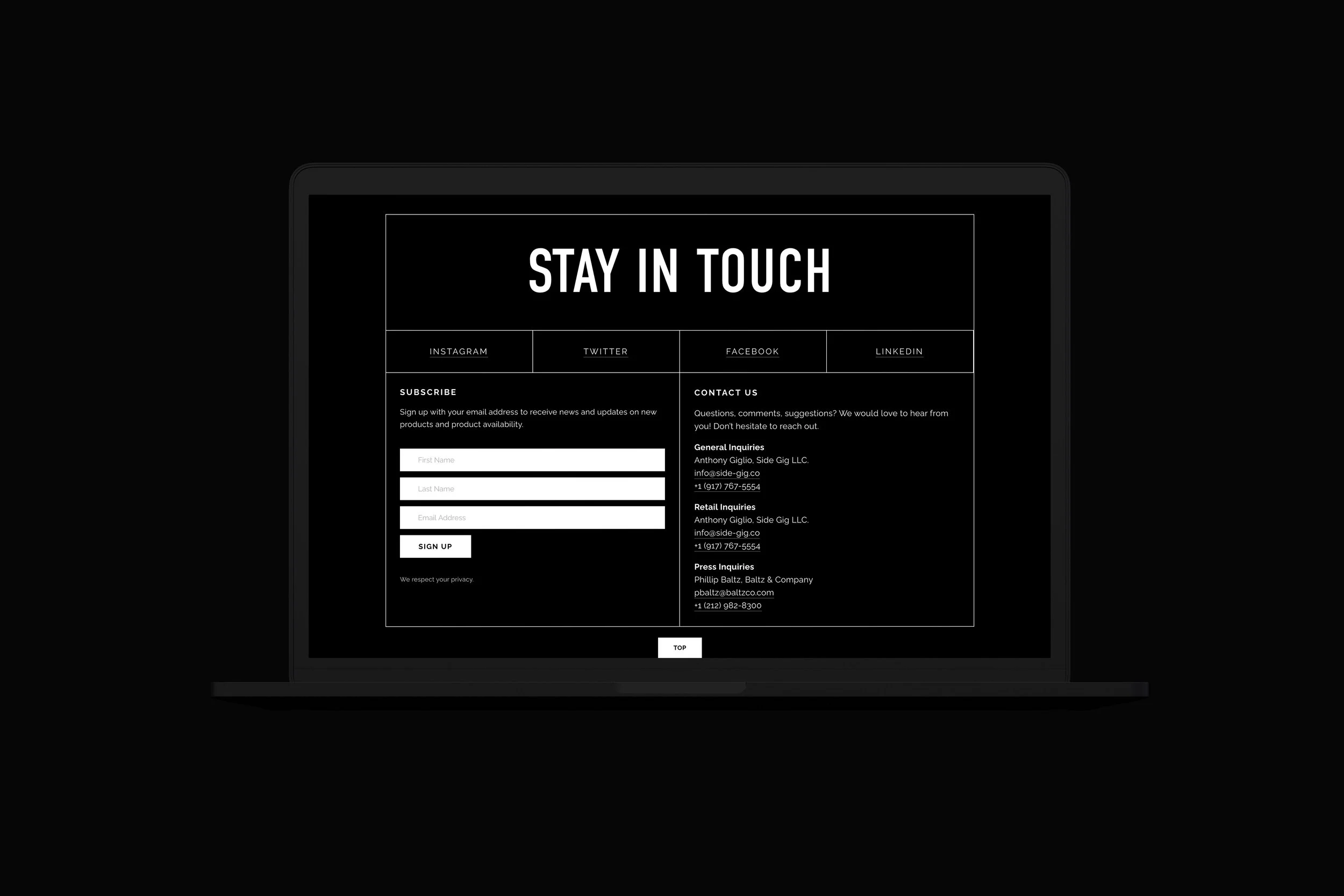
To coincide with the official launch of SuperSalt at Whole Foods, we created a landing page for visitors to learn a little bit about Side Gig as a brand, SuperSalt (what it is and where to buy it), and the owner/creator Anthony Giglio. The main menu is comprised primarily of anchor links, making it easier for users to navigate to the content they are interested in.
The page makes use of the strong graphic nature and typography of the branding and incorporates product images, links to social media accounts, and features SuperSalt testimonials.
packaging
brand positioning strategy, concept, design, print management
Side Gig SuperSalt Packaging won a 2020 American Graphic Design Award from GDUSA
The package design for SuperSalt consists of a 7.8oz. glass jar, a circular label for the top of the jar that extends down the back of the jar, and a long rectangular label to wrap the side of the jar. It includes all pertinent information (nutrition facts, ingredients, allergy information, storage instructions, contact information, etc.) and follows FDA food label guidelines and requirements.
A mix of modern and traditional, the label design incorporates classical details such as the makers signature juxtaposed with bold, modern black and white typography.
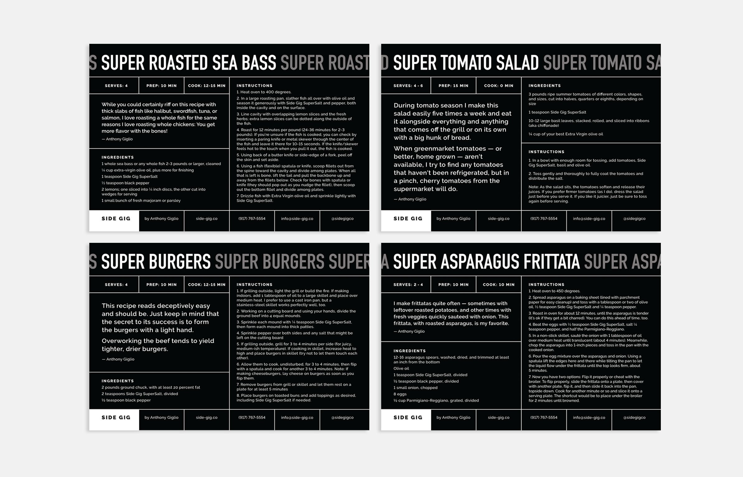
RECIPE CARDS
concept, design, print mangement
NOTE CARDS
concept, design, print mangement
collateral
concept, design, print management
To accompany the product launch we designed and developed a post card for individuals to take with them from various expos SuperSalt is featured in.
The design relates very closely to the packaging for the SuperSalt — with all pertinent information on one side, and the SuperSalt logo pattern filling the other side.


